
MIRROR
Responsive eCommerce website for a clothing brand

What’s the problem?
Mirror is a sustainably affordable and diverse clothing store which is already very successful with over 400 stores around the world. Mirror does not currently have an e-commerce site for customers to shop for clothing online. My goal is to help them refresh their current image while also designing a fully responsive website that allows new and current customers to have a delightful experience while shopping for clothing online.
Project Goals
Design a brand for the company that is modern and neutral enough to attract all types of people and styles.
Design a responsive e-commerce website that gives their global customer base easy access to their products in order to expand the reach of their business.
Who’s it for?
The target market for Mirror is for a younger demographic (20-35). Even though Mirror offers clothing and accessories for all ages and genders, their primary target market is women. Mirror is seeking to appeal to a younger female crowd who are loyal to the brand and also shop for their children and partners.

Research
To best inform design decisions, I developed and executed a research plan starting with competitive analysis and user interviews.
These were my research goals:
Identify the target users and learn about their experience while shopping online.
Identify customer’s unmet needs, current user’s needs, desires, and pain points when shopping for clothes online.
Understand preferred shopping modality of users. Do they prefer to shop with desktop, mobile, tablet?
Learn about the competitors’ strengths and weaknesses and how we can innovate to improve the overall shopping experience.

Research Methodologies
Primary Research: User Interviews
User research was conducted through 1-on-1 interviews with 4 users to learn about their experiences and patterns they follow while shopping for clothing items online. I gathered as much as I could from users to gain insight about their goals, frustrations, motivations, and analyze the scope improvement by empathizing with them.
Secondary Research: Competitive Analysis
Identifying and analyzing some of the major competitors products, sales, and marketing strategies helped gain some insight into the industry shopping trends.
Research Findings
After reviewing notes from the interviews, these three themes emerged as high priority needs for Mirror’s users:
Confidence
Users want confidence in the quality of the product before making a purchase. Accurate product photography and product inspection options within the UI are desired by all interviewed users
Convenience
The ability to find products and place orders seamlessly is what attracts the user to an e-commerce platform. A frictionless experience is paramount especially during the search for the right product and the checkout process.
Efficiency
According to the people I interviewed, the choice of having faster and/or cheaper means of product delivery and product return greatly affect their decision of shopping with a specific e-commerce brand.

Competitive Analysis

User Persona & Empathy Map
Meet Ashley
I gained a lot of insight from my user interviews so I organized the results into an empathy map, and Mirrors persona Ashley Olsen was created to help us understand the potential buyers pain points and goals when shopping online for clothing. Ashley is busy young professional who’s makes staying trendy a priority. Throughout the design process it helped to refer back to “Ashley” and think about how I could best tailor my design to meet her needs.


Interaction Design

Task Flow
This task flow was a great way for me to see step-by-step how a user would get from the homepage, to selecting an item, adding it to their cart and then checking out. This process also helped me prepare to create my responsive wireframes.
Wireframes
Low Fidelity
I design Lo-Fi wireframes early in the development process to establish the basic structure of a page before visual design and content is added. In earlier versions I struggled with how to best translate the desktop homepage to mobile. After iterating my wireframes I decided to keep the design minimal and focus on the collections with cards and engaging photography.
High Fidelity
I tried to emphasize priorities that arose from my user research and an early round of usability testing with the Lo-Fi wireframes. I moved the banner to the top to make the design cleaner while also communicating “free shipping” which was a “must have” finding from my user research. Users also expressed a need to have access to an array of content without having to click around excessively. To meet this need, I added the “You might also love” and “Trending Now” features to increase the visibility Mirrors products.

Branding & UI Kit
Once the wireframes were created it was then time to design the final visual aesthetic of the Mirror brand. The re-branding of Mirror was done to be more neutral, modern, luxurious, and inviting. The goal with the branding was to have Mirror stand out as an e-commerce clothing site but also follow current design trends that will aid in growing their online presence.
Prototype
After creating high-fidelity wireframes, I created a prototype for the user to accomplish a defined task.
Task 1: Purchase Talulah Dress
Task 2: Sign up for an account
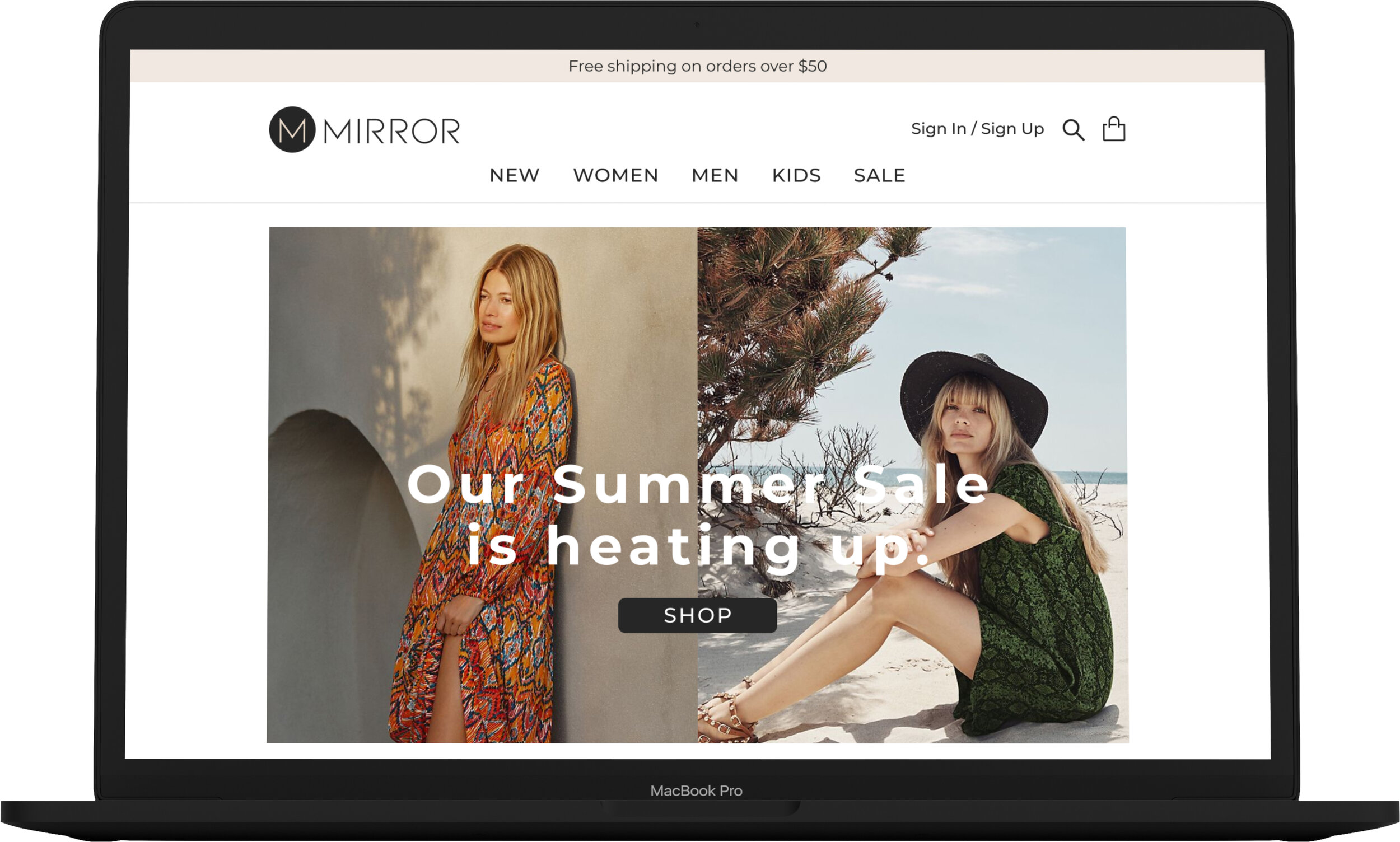
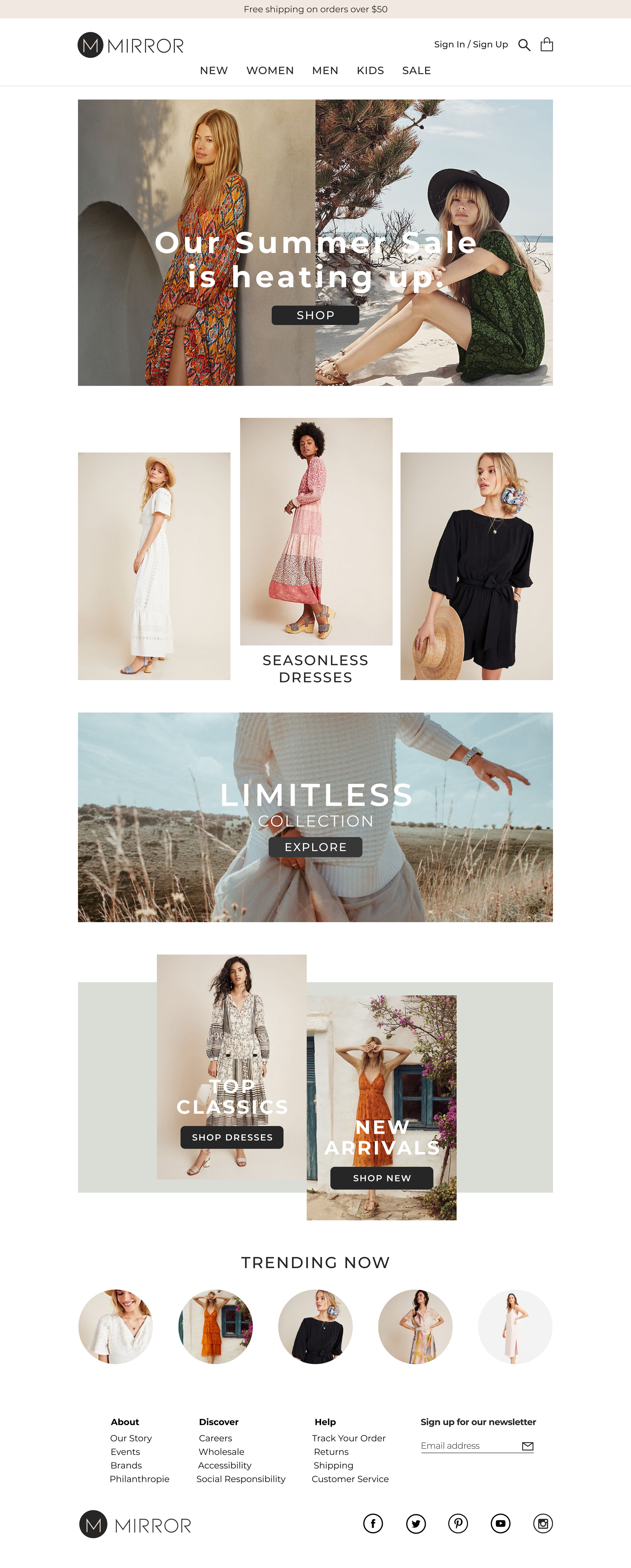
Homepage
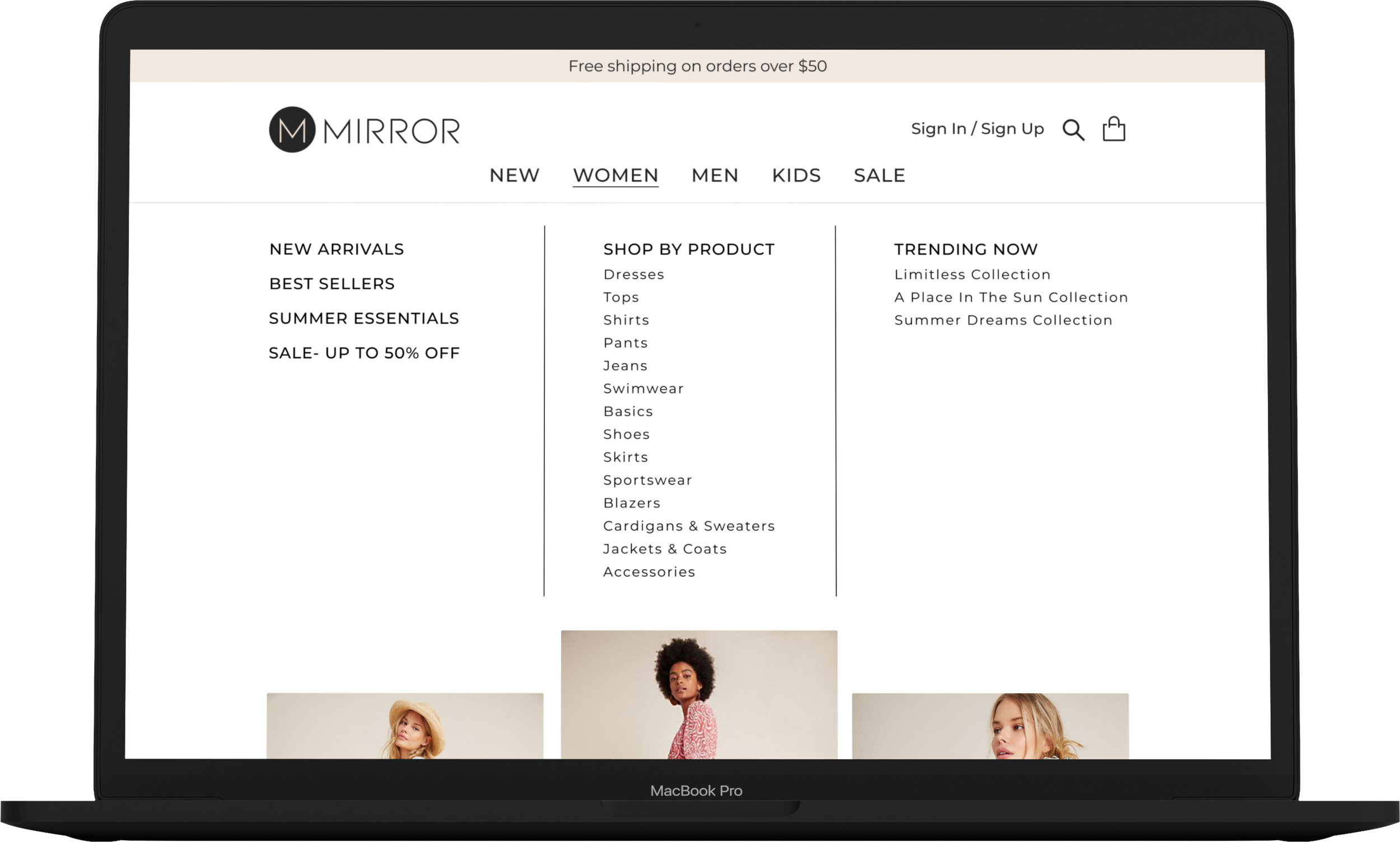
Navigation expanded
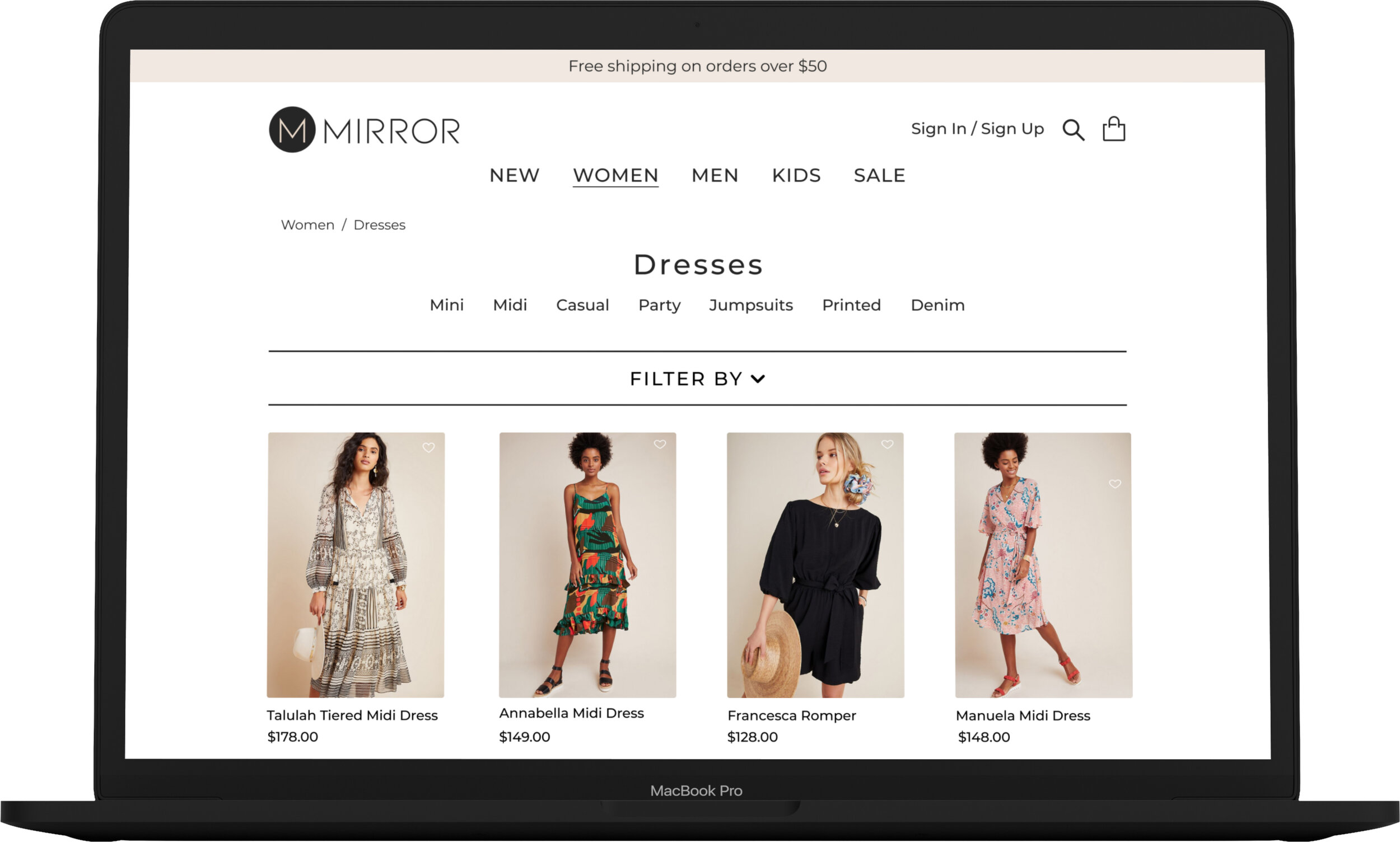
Product List Page
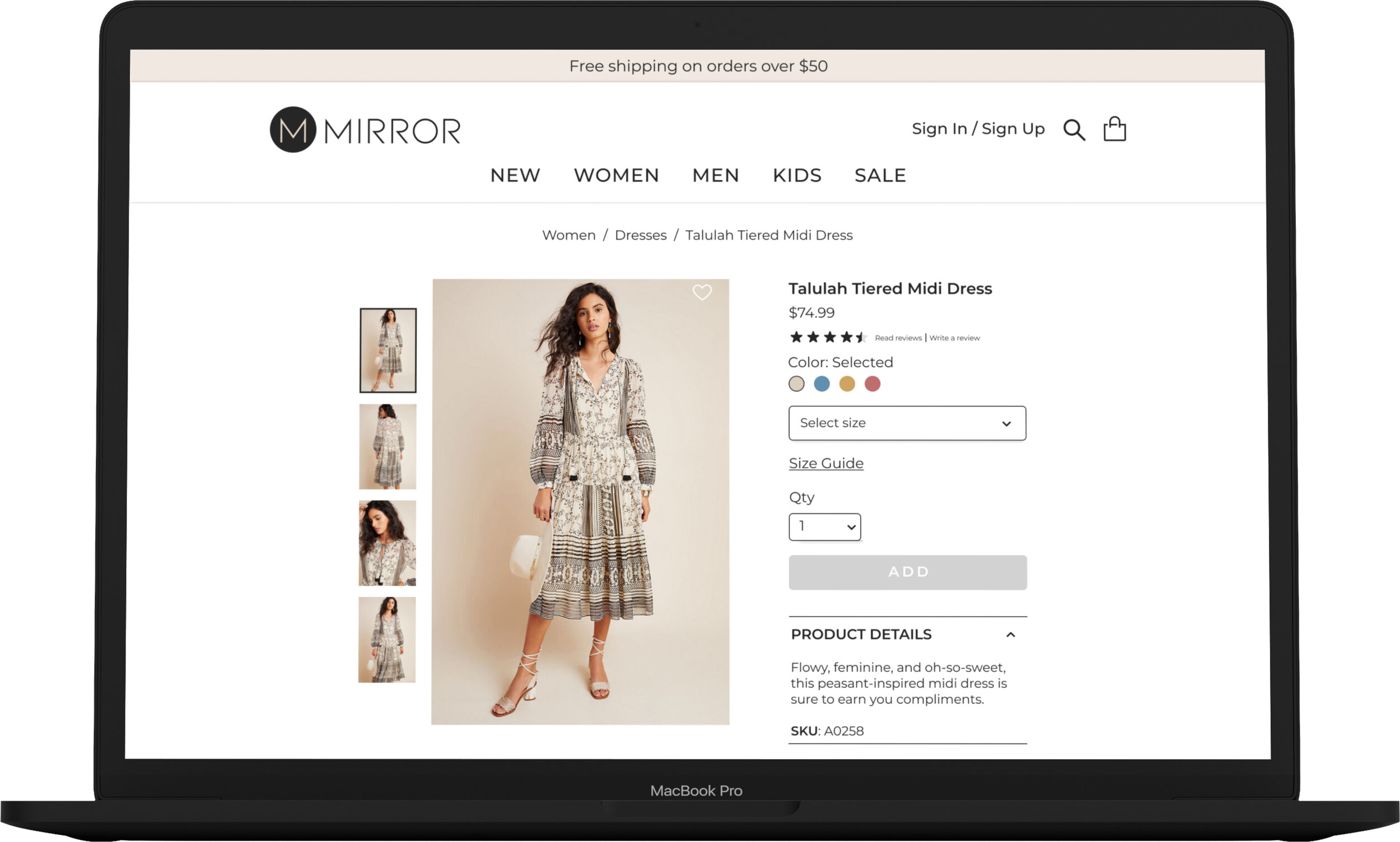
Product Page
Homepage

Product Page
Usability Testing
Once the interactive prototype was designed, I was able to conduct usability testing to study how users interact with the design and how it can be improved. I was curious to see how users navigated themselves around the site and to see if the checkout process made sense to them.
Test Goals:
Observe how users react to the design of the prototype
Observe how much time it takes users to complete tasks
Discover elements of the website that are frustrating to the user
Determine ways to improve the website for an optimal user experience

Affinity Map

Despite only having 4 people volunteer for user testing, I was still able to collect some interesting results. The task was to locate an item, women’s midi dress, add to cart, and checkout. I was glad I that all of the the participants were able to complete the task I had set.
Two of the users had trouble selecting product details like size and quantity. I was able to tweak some of the elements to improve the usability of the site. Another two of the users mentioned that they’re used to seeing a pop-up modal with order details before checkout. I thought this was a great idea and after some research this feature was added to the prototype. I also received feedback that it would be helpful to have easier access to reviews so I added a more accessible reviews feature to the product page. All of these iterations worked out wonderfully in the next round of testing.
Added features from testing feedback
Reviews Feature
Reviews expanded
Checkout Modal

Conclusion
I enjoyed working on this project and with more time, I'd like to iterate further and develop the full site design and app. The challenge of enabling users to feel confident about their selections is one I'd like to pursue further. What features would help users feel more informed when it comes to the quality and fit of the products they're considering? How can we improve upon the basic functionality and features of the site, to take them to a higher level of proficiency and inspiring delight? Iteration is a necessary part of the design process. Even if you think a design is “final” and fulfills all of your user needs and stakeholder goals, there is always room for more research, testing and iteration. I learned a lot from this project and I look forward to designing more e-commerce products.